Menu
Contact
Enquiries
info@csqd.com.au
Subscribe to our newsletter
Contact
Enquiries
info@csqd.com.au
Subscribe to our newsletter
2019 – Present
Clarke’s Design and Construct is an award-winning construction company that has been in operation since the mid 2000s. A 15-year-old business is ideally placed to take stock of their market position, explore who they are as a business and where they want to be moving forward. A rebrand is not about starting a new business. It is a process that explores business values and objectives, refines audience and customer needs, and how to put pressure on the competition. For Clarke’s, this rebrand was a way to let the industry know: ‘Hey, we’re here. And we mean business.’
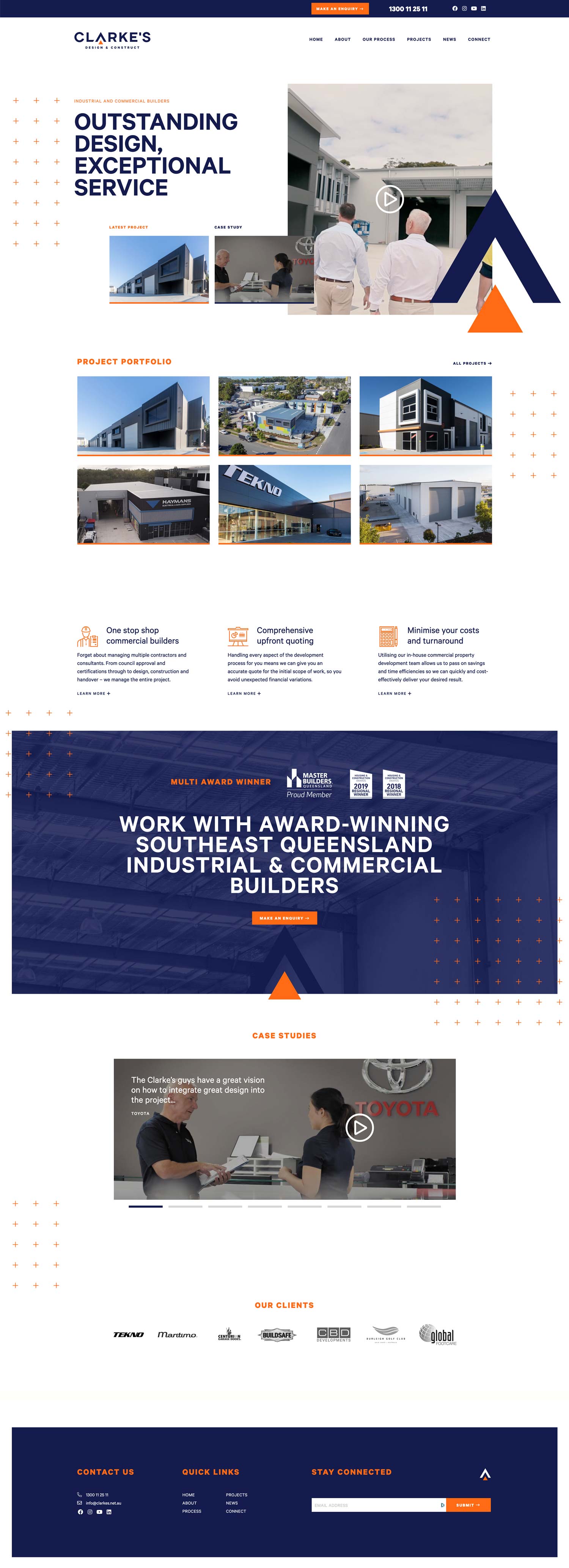
We started with a series of meetings to collect data and really understand the business. We tracked every design touchpoint in the client journey to ensure we didn’t miss a thing. Next, we established a creative direction. This starts with three different ‘CSQD brandscapes’ that cover colour, font, layout and overall feeling. From there, we finalised creative direction and moved on to logo development and the most important part of the Clarke’s rebrand: the website solution.
The Team at CSQD were thoroughly professional, supportive and creative from the brand exploration discussion through to the rollout of the branding and digital architecture and then in providing support after execution. Have referred them to my clients many times since.
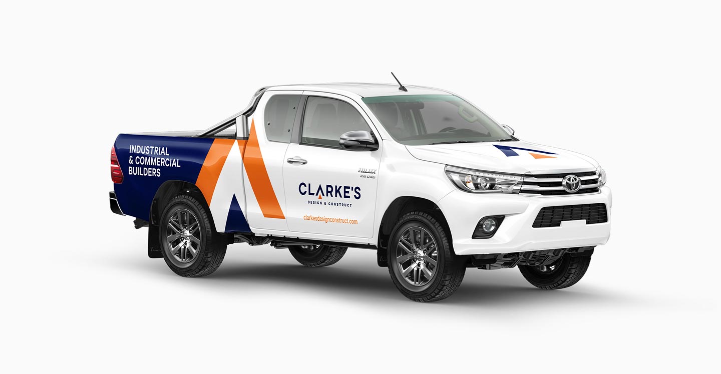
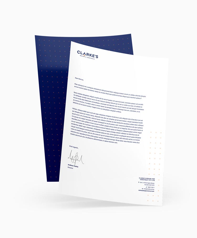
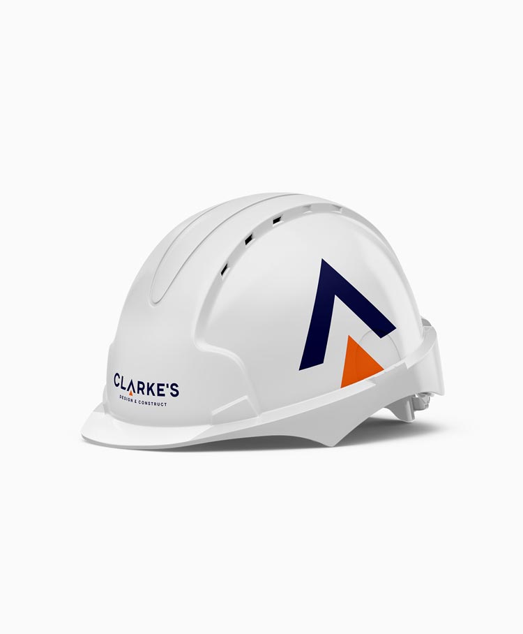
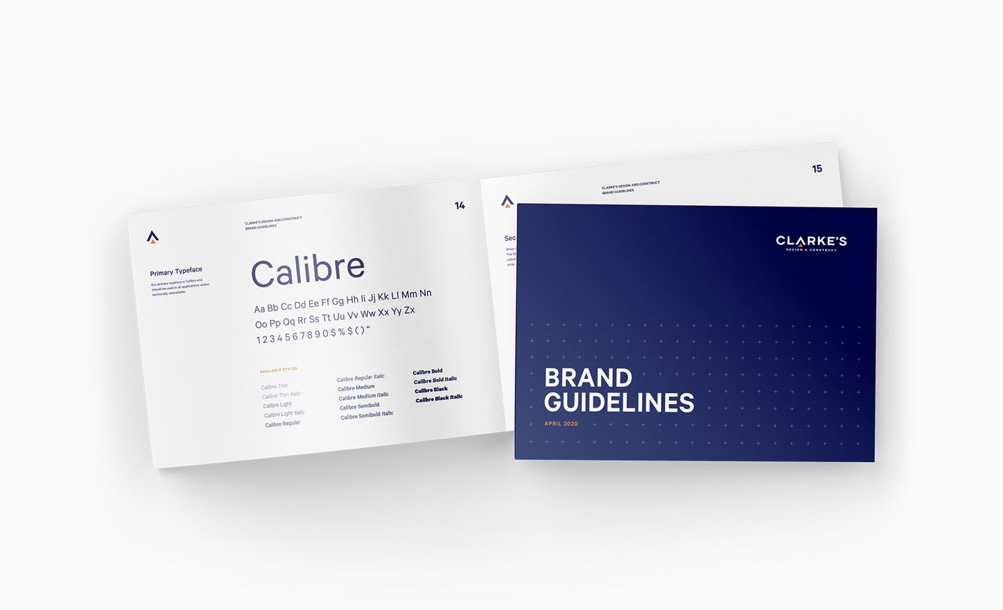
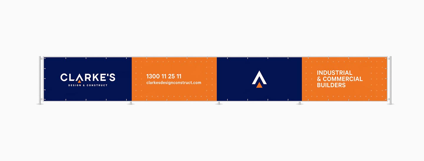
The new branding is strong yet simple. It gives Clarke’s a platform to showcase their straightforward, collaborative approach and can-do attitude. It’s fun without being frivolous and makes it clear what Clarke’s actually do. The cross pattern used across the website and collateral stems from architectural plan drawings – a nod to the design part of the business – and ties everything together. The branding has been rolled out over many applications and has been a huge success.
Address
Suite 32, ‘Pegasus Centre’
42 Bundall Road
Bundall QLD 4218
Subscribe to our newsletter